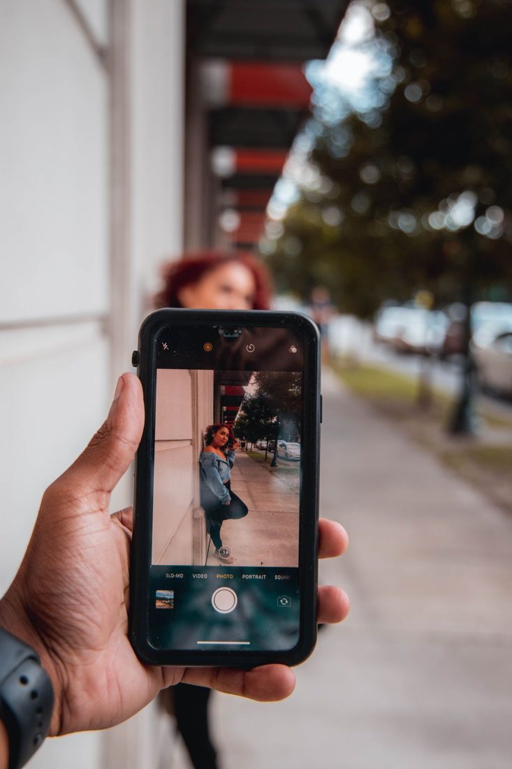
Portrait mode can make a person stand out against a busy background, but blur is not automatically an improvement. Some photographs need the room, tools or other people to remain readable. Start with the purpose of the picture and compare a normal frame with a portrait-effect version before deciding which one describes the scene better.
Ask what the background contributes
For a simple head-and-shoulders portrait, reducing background detail may direct attention to the expression. For a person demonstrating a craft, that same effect may hide the workbench and tools that explain the picture. Decide whether the surroundings are context or clutter. If they are clutter, first try a cleaner angle. A camera effect is easier to judge when the arrangement already works instead of carrying the entire burden of simplification.
Inspect boundaries that are difficult to describe
Look closely around hair, glasses, fingers and gaps between the body and an object. Check whether the effect treats those areas plausibly. A blurred section inside the subject or a sharply retained patch of distant background can become distracting.
The exact behaviour depends on the phone, camera mode and scene. Apple documents adjustable background blur for supported portrait photographs, but those controls and capture options are model dependent. Consult your own device’s guide rather than assuming every portrait image can be changed in the same way later.
Make a normal comparison frame
Keep the same position and take a photograph without the portrait effect. Compare expression, focus and background information, not just the strength of the blur. The ordinary version may be more convincing when the subject holds a transparent object, stands behind a fence or overlaps another person. Save both when unsure. A good photograph can have a recognisable background, especially when its colours and shapes support the subject rather than competing with it.
Reduce the effect when it calls attention to itself
Where your phone allows adjustment, try less blur and examine the result at the size you intend to share. Strong separation can look appealing as a tiny preview but awkward around detailed edges when enlarged. Avoid stacking several stylised lighting and blur effects before evaluating the basic photograph. Keep the original and make restrained edits on a version you can compare. For product images, be particularly careful that the effect does not obscure details a viewer needs to assess.
Portrait mode is one possible treatment, not a requirement for a portrait. Use it when it makes the subject clearer without breaking important edges or removing useful context. A normal comparison frame gives you an easy way to choose the stronger photograph rather than the most obvious effect.